


Color Math. But not really….
Color Math. But not really….
Because math is objective, there is a right or wrong. Color mixing? Not so much. I’ll explain here.

In my 27 years since having founded Tibi, nothing has gotten more chatter than the Tibi Color Wheel. The most talkative are those curious for the right or wrong of it. What color ring paired with another color ring will spell doom or success? What’s the exact hue equation we should strive for? Listen, I get why the questions. There’s something comforting about certainty. But for me, swimming in the pool of nuance is a great place to be. The good grey space, but articulated. I’ve never liked rules for rules sake. I want to know the why behind them, and it’s in the discovery of the why that you get to the crux of the matter. Why some colors work together, and some don’t. Having lived and traveled to other countries, having surrounded myself with a team at Tibi so incredibly diverse that we could be mistaken for a UN assembly, I’m acutely aware there are conflicting views on color from an aesthetic lens. And aesthetics are often derived from how and where we grew up, so you see here, this is anything but black and white. But generally speaking, colors illicit a “vibe” when worn together in certain combinations. And the feeling we get from different combinations, barring some cultural customs that may have us diverge, there are clear commonalities.

Quick refresher:

Ring 1 - black. Strong and harsh.
Ring 2 - the classic neutrals. Predictable, sharp and describable: Brown. Grey. Tan. Navy
Ring 3 - the no-name colors that function as neutrals. Calming, subtle. We’ll all disagree on the perfect description and we often find nail polish color names helpful here: caramel, pecan, lotus, sage
Ring 4 - saturated colors - both brights and pastels. Happy, energetic, pretty: baby yellow, lavender, magenta, cobalt.
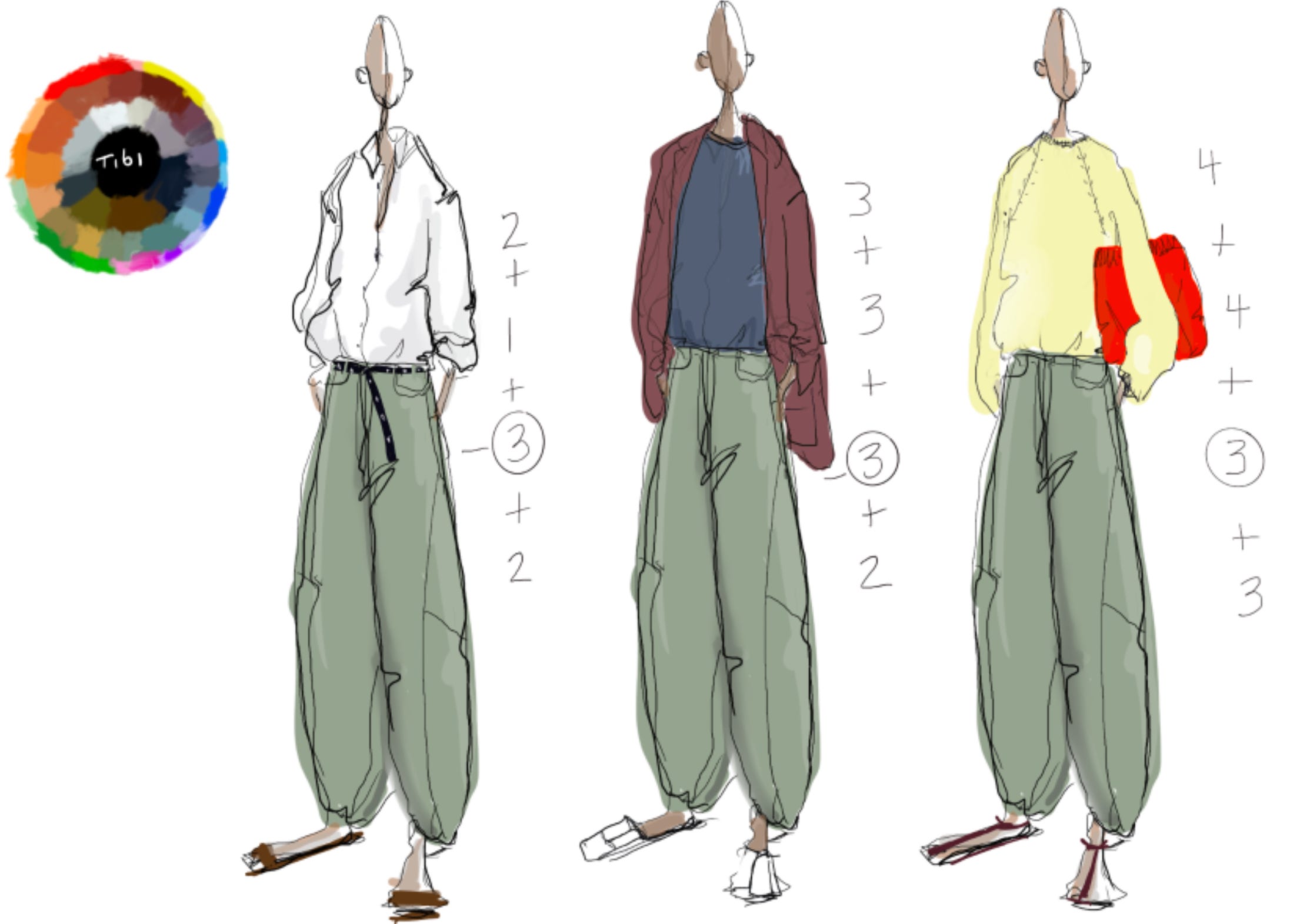
Ok, my drawings should bring this to life for you.
Let’s start first with ring 1 and 2. These are classic neutrals. Remember, ring 3 behaves like a neutral but not in a classic way - the queen of classic’s Jackie Kennedy didn’t go sailing in an ochre pair of shorts and light asparagus top after all.

The navy trouser skirt here is what I’ve used as a base (sometimes my drawings aren’t so clear, I apologize). The vibe? You may use words like “business like, put together, focused, serious” to describe how you feel when liberally mixing these two rings. The closer together the colors are in the rings, the more “cohesive” you feel. Jump a ring, and you can feel more excitable, your emotions a bit heightened. Not a bad thing - it’s just important to say it so that if you mix ring 2 and 4, and you’re seeking calm, you may not feel it. Knowing WHAT to change, rather than haphazardly taking another stab at a great outfit, wastes time. Knowing how to identify the source of the problem is critical. It’s usually impossible to combine rings and effect a different outcome than what I’ve played out here. I’ll prove it.
Here’s another round of sketches I did - employing varied combinations of rings back with black. You can see (feel) the different effect, right?

Here I’ve used the black drapey suiting short as the base. In all black with the python slingback, Here, it’s full on chic. Milan, New York, Hong Kong dinner out ready. That same short, paired with a ring 3 cinnamon brownish Top takes the urban vibe down a notch. It becomes a little more eased out, but in the most sophisticated way, because it’s giving lots of depth to a look - a nuanced color will do that. It’s the shade people don’t think to put with black, the less obvious path chosen. I always feel a bit smarter when I pair ring 1 with ring 3. To feel it is to become it. Smarter, that is. And last, pairing the black short with the strong ring 4. Happy vibes. Note here: your learning is cumulative. That brighter ring 4 color is in a big sculpted sweatshirt for a reason (BIGS Vocab here). Had it been a basic cotton tee, the “feeling average” vibes would have wrecked this. It’s complicated, until it’s not. This knowledge will get visceral fast, I promise. I have proof.
Ring 3 as base.
I’m going to use the greenish silk-cotton Sid as a base here.
In the first look, the vibe is quite classic BUT NOT preppy. There’s a very distinct difference and it makes the style much more malleable traveling from city to city. If your style is chill combined with modernity and classic, then you can see how a pant in a ring 3 color can keep you grounded in your personal style whether you’re in a hyper laid back city, an overly chic-ed out locale, or a brightly colored more preppy-fied part of the word. Mixed with ring 2, the green-ish-brown-ish tones become a bit cleaner and more sharp. Paired with all ring 3’s, the look becomes extra chill - so chill I like to mix in a bright white item to dial it back up. And here is where ring 3 does the extra good work- when mixed with ring 4 it takes it all down a notch. Most people make a mistake in their wardrobe heavying up on ring 4 colors in an attempt to augment a wardrobe too steeped in ring 1 and 2. What they inevitably find is they create a large assortment of bold contrasts in the closet that lack the subtlety created when ring 3 and 4 come together.
Simply adding a few ring 3 items to your wardrobe will make all your colors go much further. You can see here, I’ve drawn in my favorite Red slip dress as the example:
Layered over a white tee, the dress is high contrast. Nothing subtle here, I’d feel quite strong strolling around in this color mix. But if that’s not what you’re going for, if you want to dial it down, you reach for the cinnamon-ish brown-ish top - paired with the red, everything just mellowed out. The red still gives energy, but the vibe is more softened. And last, paired with all ring 4’s it’s super high energy. The good ton, I would feel quite happy and chic in this combination. Exuberant is a good word. But lest I totally lose myself, I would ground it all with the perfect ring 3 sandal. This burgundy-ish wine color adds that level of uber sophistication - a brighter shoe would have tipped my scale. But that’s me.
Listen, it sucks when someone tells you to go experiment without the tools to do it. Much like a chemistry lab with no beakers or dangerous liquids, what would be the point? You’ve now got some good direction here to get in to your closet, but nothing here you do in the privacy of your home is going to cause an explosion. This is low risk learning here, ok?. Try some things on. Pay attention to how they make you feel. You’ll get it, I promise. And when you do, you’ll be writing me for more ring 3 pieces to be made. It’s interesting, those merchandisers at designer brands always kill those color first. I think it’s because no one has ever really explained their purpose. Now you know the purpose, and much more. Ok?
This right here is sacred, holy work! Geez… heaven is opening and angels are singing. Thank you for the clarity and visuals, Amy! This is so good!
Okay! Just spent five days with friends on a getaway in Byron Bay (Australia) it was heavenly, aside from all the walking talking eating and drinking we also did a spot of shopping and I was able to properly verbalise for the first time why sometimes we needed to tone the outfits down and used ring three colours to do so! Thank you for giving us the words and confidence to verbalise what was a strong intuitive feeling that I had yet didn’t know how to properly express ♥️