

The Definitive Guide to Wearing White
The Definitive Guide to Wearing White
Coming from someone who hates speaking in absolutes.

Speaking in absolutes can box you in, and I hate feeling constrained. But there is are a few principles, my style guardrails, that are fundamental to dictate when I feel good in when I’m wearing. And conversely, when I do not.
As a Creative Pragmatist, I always feel myself when I am dressed in a way that conveys balance. When the message I’m sending seems to have a natural “but….” at the end:
Serious, but….. Chill, but……. Edgy, but……. Pretty, but…..
Others do not feel that way, and that is more than fine. It is expected, because we are all individuals. They employ a strong message that is more one dimensional. This is what makes them feel best. Their look often has a “damnit….” at the end and said with a stomped foot.
Serious, damnit…. Chill, damnit……. Edgy, damnit……. Pretty, damnit….
A quick search through Shutterstock gave me the visuals to help me better communicate this. Four tropes that we can imagine saying: I’m in all this leather, I’m edgy, damnit. If you don’t believe that tropes exist, consider this. If you’ve ever worked in Hollywood (I haven’t) you know that CASTING is a critical step in the production process. Finding the right character that communicates a message the quickest. If we were casting a film right now, I think we all know the characters each of these individuals would play.
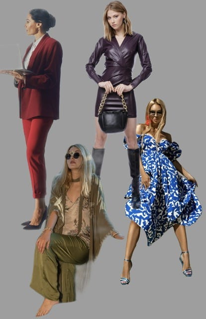
In fact, the photo description given to the upper left woman was: successful financial management woman holding computer gazing at city skyline. She looks the part. The thing is, for many of us, we’re not playing parts in a film, we’re living a varied life and have a range of feelings inside of us we want communicated at all times.
ALL of this is to say that if you wholly disagree with reasoning as to WHY brights with whites often rub your wrong, if you see yourself in the “don’t” column and are offended, it would be helpful if you rephrase any offense and think “oh, I see. It’s not ”don’t wear this- absolutley”, it’s “don’t wear this if it makes you feel a certain way and if that is the case then here is a guide to help you figure out the way to wear it that will make you feel much better, and yes, I get your issue because most stores and magazines have been catering to my point of view here so I see why you’ve been confused for a long time….” Why is it important to me that you interpret it this way? Because I have a lot of friends who like brights with whites and I love them, and they feel good in their outfits, and they look good in their outfits. But it is not my style, and guess what, my style is not their style either.
Ok, so we move on to the: DO this, NOT that, section - the fastest way to convey my thoughts is through visuals, so where we go.
DON’T
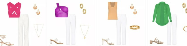
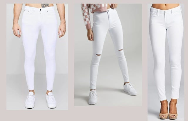
BTW, since this is how a prominent ecommerce site directs you to style the white jean - I lifted this with no alterations - my point that Creative Pragmatists are highly underserved has been made. I rest my case.
In order to create the best visual DO’s, I’m leaning heavily in to the ANTONYMS. This is the idea that when you are getting dressed, do this: If your outfit isn’t getting you where you want to go, describe the way it makes you feel: I feel too…..Preppy. Classic. Basic. Whatever it is - because if you can say the way it’s making you “feel” then employing the opposite into your mix may turn the outfit on its head.
DO
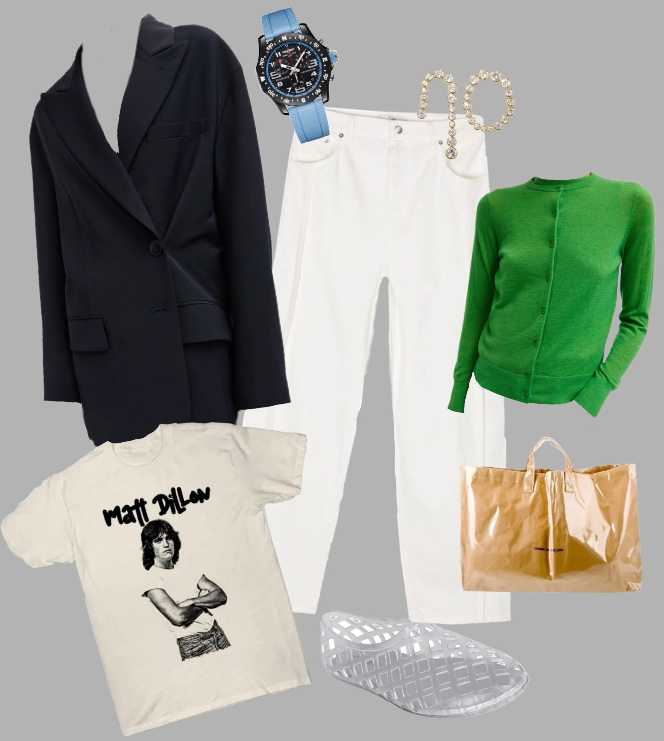
The desire: The quest for color without feeling like you’re South Florida’s top realtor headed out for a headshot for a marketing campaign slated for every bus bench along Worth Avenue. Very expected and ladylike. To counteract this feeling, bring in items that are: unexpected and masculine. It’s not about DISMISSING the color as it is about balancing it to achieve how you want to feel - interesting, chill, and modern.
The unexpected: the gummy watch, the asymmetrical earrings, the shoe that makes you look barefoot in the best way possible, the tee that says something if to no one but you, the bag that is super functional but hardly common, and the knit that is light enough to thread through your beltloops and give that touch of color - but it won’t have everyone tapping your shoulder to ask if that house in Flamingo Park is worth the asking.
+note - I have lots of friends in realestate - I’m going for the easiest trope here to make a point.
DO:
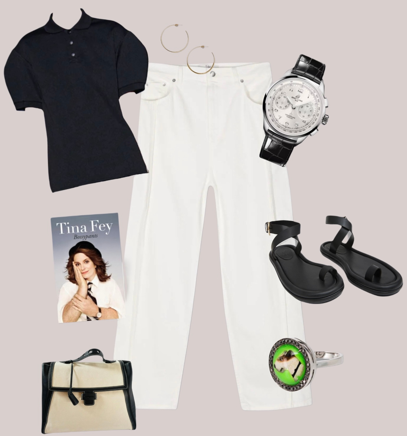
The desire - you’re craving a chicly minimal black and white look, you’ve imagined yourself in Sweden sitting on a cream shearling bench and admiring the past works of Zaha Hadid.
If I gave interiors as an example, you’re striving for this:
But coming up with:
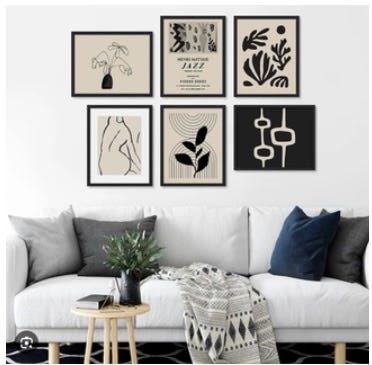
Not terrible. But in your quest for minimalism, you landed on a feeling you can describe as basic, average, played out. And now you need to employ your antonyms to right how you feel. The opposites of basic and average: modern and pushed. The black polo here, the scale is oversized and the material strong and textural. The watch here straddles modernity with the large scale and silver face. The sandals here give lots of skin and function as a basic should but with more attitude. The Francesca Villa ring is grounded in classic but highly personal. And the bag by Myriam Schaefer (you can find on Vestaire often) exudes practicality with chic and discreet - luxury predicated on workmanship, functionality and scarcity. And the hoops here, by Jennifer Fisher, pure classic and chic - you can lean in here with this as the ease and chill of the white jean keep the proportions balanced. No tropes here.
DO:
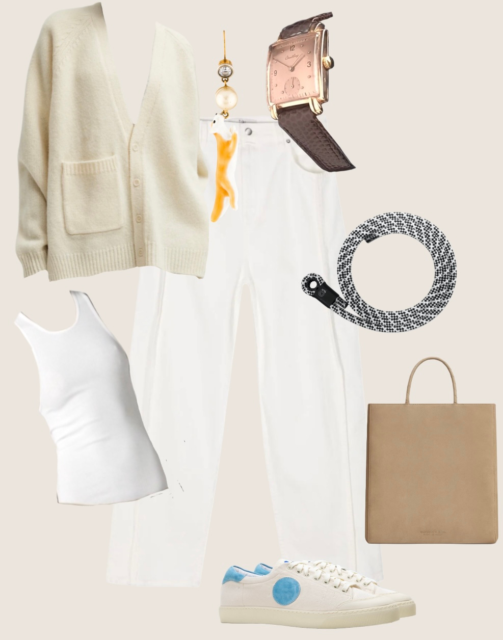
There’s something so calming about the idea of all whites and shades of. Somehow you imagine it will center you, make you feel like yes, I can do all of this and not get rattled - your partner chewing loudly near your ear? Yep, bring it on, you’re extra chill. But the vibe you’re feeling in the basic white tee, the white pants, the soft buttery sweater and leather camel ballet flats leaves you a bit…..meh …. a bit mature. The opposites of meh and mature: friction and irony.
Friction comes for texture play in a range of textures - from the nubby wool of a the cardigan here, to those strange fox Celine earrings you invested in years ago and can still find at the Real Real, and this rope belt I found here when I went on a search quest for a belt, with texture, that wouldn’t be too wide, be more afterthought in vibe, and a dosage of irony worn with the vintage Breitling watch. The white sneakers in canvas here and the simple ribbed tank are giving a wide range of textures. In one look you’ve employed: woolen, denim, enamel, snake, rope, canvas, and ribbed. Layers of friction and irony obliterate the MEH.
DO:
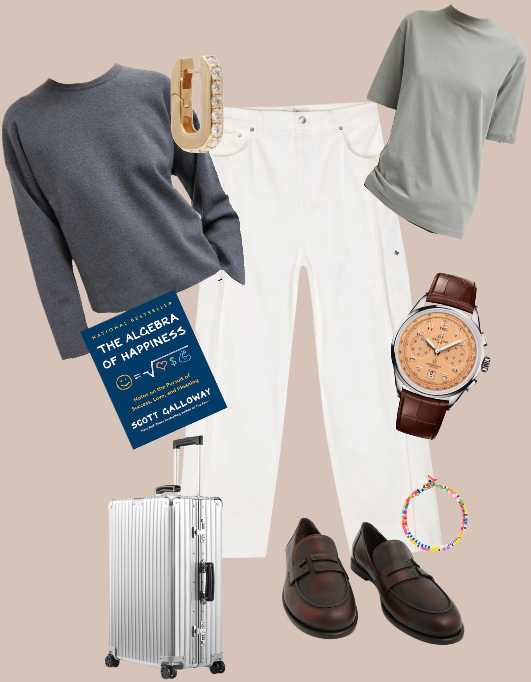
You’ve invested in white jeans and you want to wear them more frequently - who wouldn’t? A low cost per wear is incredibly fulfilling - it’s less wasteful, it saves money, and ultimately it affirms that you know your personal style and how to do it often. The ring three “ish” colors temper whites and set a tone for nuance. White jeans can feel quite “specific” and limited to the tropes of Real Housewives of NYC, a Palm Beach Realtor, or Diane Keaton in a kitchen - which I love, but alas she is Diane and that kitchen is fabulous and at the end of the day I simply don’t feel like me in this trope. If you are looking to mitigate the feelings of: “obvious” and “statement making” do it with employing the antonyms of: depth and subtlety.
The bluish, greyish, heavy cashmere sweatshirt here, with the greenish, pewterish tee, the single earring from Vada one of my favorite independent designer brands all play in to the idea of the one who enters the room in style rather than an outfit. Throwing in irony by mixing a classic loafer with a brightly colored anklet here lets you work in your modifier (whatever yours is, mine is HUMOR). Need more info on modifier you can find it here. It’s the mix of the hard metals, the ish colors, the textures and the irony that give all the depth and when depth is a cornerstone of our personal style (depth of thought, consideration, etc) then this makes this a white jean you’re like to wear. A lot.
Ok, now proof of concept. Have I employed all these tricks when wearing white? Yes, I have. Over and over.
Remember the idea here is not to get you frantically clicking on specific pieces, it’s helping you walk away understanding:
The reason why you are not wearing your white jeans (in this example) is that the tropes are loud and they’ve taken over the airways, the ecommerce sites, and a lot of the conversation led by a salesperson at your nearby department store. What that means is, as per usual, the simplest route to mass communication, and sales, is to double down on one dimensional tropes. They tend to sink in easier, far fewer words required. This wordy article serves to give you dimension to create the look that matches how you want to feel. And bust apart the tropes.
The actions you can take to create the feeling you want from your jeans. Employing antonyms first to help you problem solve with real tools either already in your closet or in need of bringing in: friction, irony, humor, seriousness, sophistication, etc.
When you begin to think about your future purchases in terms of filling up a tool box, rounding out your vocabulary, you’ll get to the place where your clothes and the way you want to feel in them have come together. And you’ll be able to pull those white jeans lingering in the back of your closet and get some wear out of them.
Oh, unless they look like this:
I’ve gotta draw a line somewhere. Ok?
I actually find the posts where "some may get offended" the most helpful!
The word trope has really hit it home for me. I finally get it- together with friction/ antonym- why when I try to match the color, vibe, whatever of an outfit in each piece, why I feel flat and as if I’m dressing for a part.